Citizen Science Site
A public water-quality dashboard — an interactive grade-coded map, trend charts and a heatmap over live field data
A Next.js web dashboard for community-collected water-quality data — an interactive Leaflet map with A–F grade-coded markers and a heatmap mode, multi-parameter trend and comparison charts, and region/date/grade filtering, reading from a shared Firestore collection.
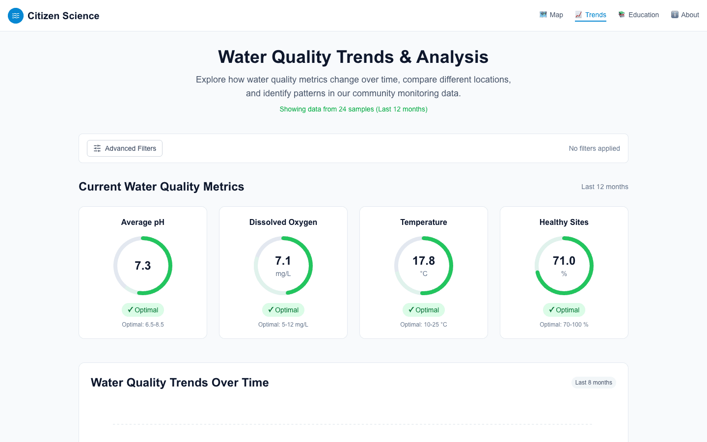
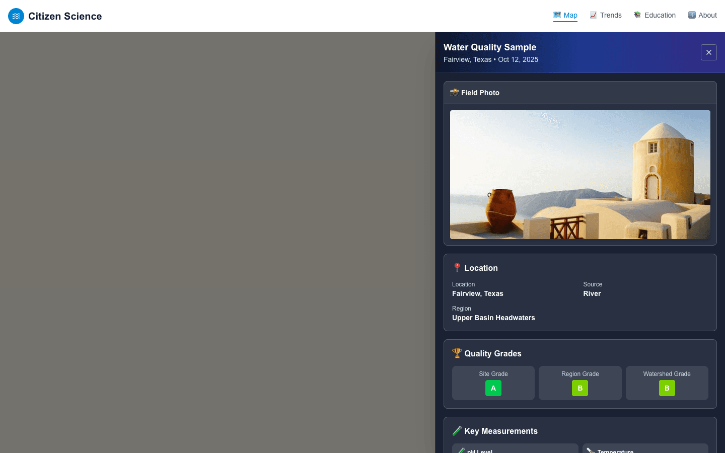
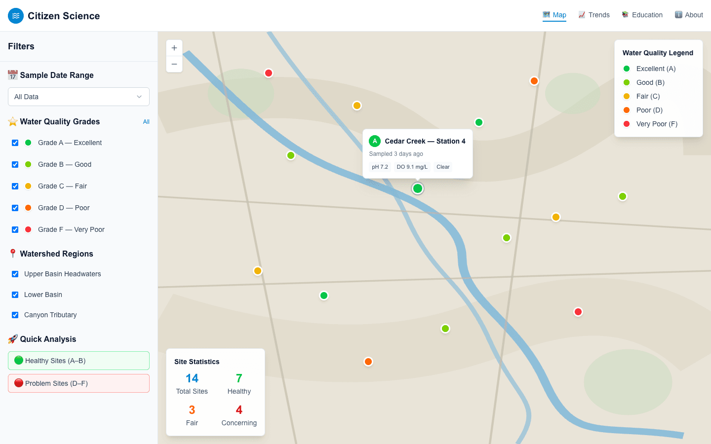
Source is private. The grade-coded map, the heatmap mode and the live-computed landing stats are explained below.
About this project
The core screen is an interactive Leaflet map of water-quality sample sites, each marker color-coded to a site's letter grade (A–F) computed from its underlying measurements. Clicking a marker opens a detail panel with the full measurement set for that sample — pH, temperature, dissolved oxygen, nitrate, phosphate, biological oxygen demand, salinity, flow rate and turbidity — each shown against its healthy range, plus the site/region/watershed grade breakdown and any field photo and notes attached to the sample.
A second visualization mode renders the same data as a heatmap (via leaflet.heat) with a per-parameter color scale, and a trends section (Recharts) adds time-series charts, a metric gauge, and dedicated regional, water-source and grade comparison charts, all driven by a shared filter panel — grade, region/watershed, date range and parameter — and a custom time-range slider.
This web app is the public, read-only data portal: samples are collected through a separate mobile app, and every data hook here only reads from Firestore. It is the public-facing analysis layer of a citizen-science field-data pipeline.
An education section (beginner/advanced toggle, a metric glossary, and plain-language explanations of each water-quality parameter) targets a non-technical audience — schools and community volunteers — and a landing page computes a small set of live summary stats (total monitoring sites, average pH, percentage of A/B-grade sites, distinct contributing schools) directly from the same Firestore data at render time rather than hardcoding them.
Key features
- Interactive Leaflet map of water-quality sample sites, markers color-coded A–F by computed site grade
- Heatmap visualization mode (leaflet.heat) with a per-parameter color scale, alongside the standard marker view
- Sample detail panel: full measurement set (pH, temperature, dissolved oxygen, nitrate, phosphate, biological demand, salinity, flow rate, turbidity) against healthy-range reference values, plus site/region/watershed grades and any field photo
- Trends dashboard: time-series charts, a metric gauge, and dedicated regional, water-source and grade comparison charts, all driven by one shared filter panel (grade, region/watershed, date range, parameter)
- Live-computed landing-page stats (total sites, average pH, healthy-site percentage, distinct contributing schools) calculated from the current Firestore data at render time rather than hardcoded
- Beginner/advanced education mode with a plain-language parameter glossary for a non-technical (school and volunteer) audience
More in Education
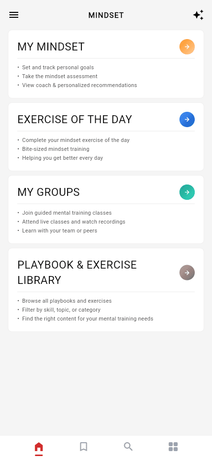
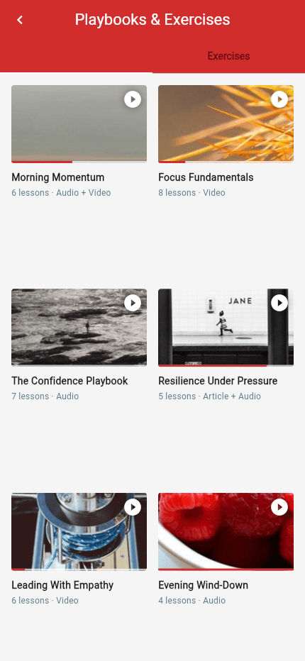
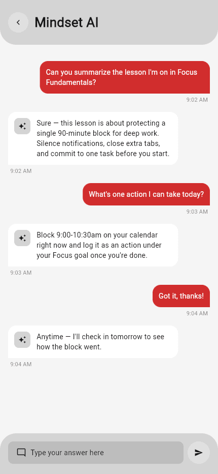
Learning Management System
AI-assisted coaching platform — student app, admin console, and a multi-provider AI backend
A Flutter learning and personal-development platform built as a student app and an admin console over one Firestore backend, with an in-app AI assistant — chat, per-lesson summaries and recommendations — powered by a dedicated OpenAI/Gemini/Groq backend with vector search over the course library.
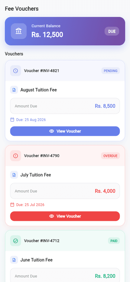
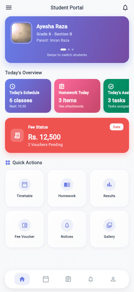
School Management Suite
Three coordinated apps, one shared backend
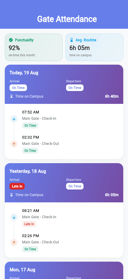
A school-management platform built as three coordinated Flutter apps — a student/parent app, a teacher professional-development app and a staff operations app — sharing account and content infrastructure, with a standalone AI prototype exploring automated student-performance summaries.
VU Helping Kit
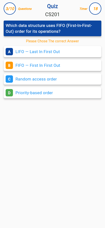
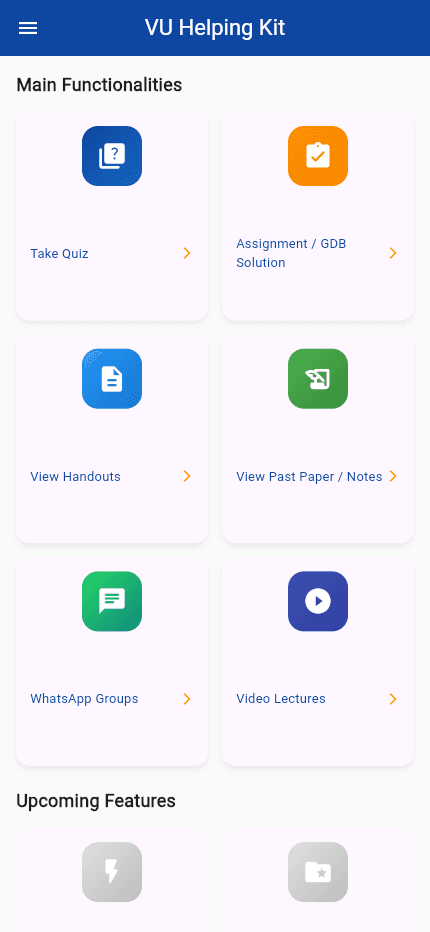
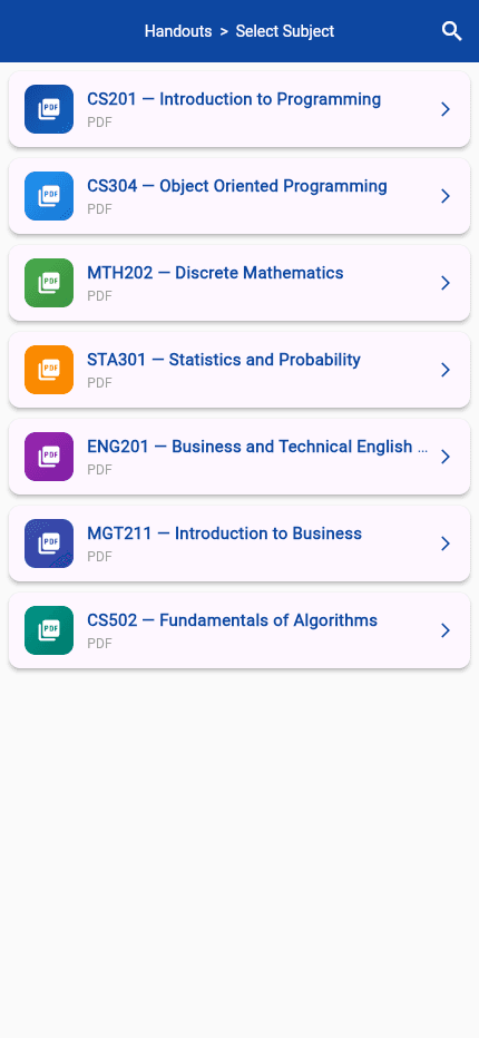
A timed Firestore quiz engine, PDF handout library and study-group directory for distance-learning students
A solo-built Flutter app for Virtual University of Pakistan students: a category-driven quiz engine pulling randomized, timed questions from Firestore, plus browsable handouts, past papers and assignment solutions delivered as cached PDFs, alongside a WhatsApp study-group directory and video-lecture links.
~/sherazi.dev$./say-hello
Say hello.
Questions about a case study, one of the packages, AI tooling or Flutter in general are always welcome.
// or browse the packages on pub.dev(opens in a new tab)